

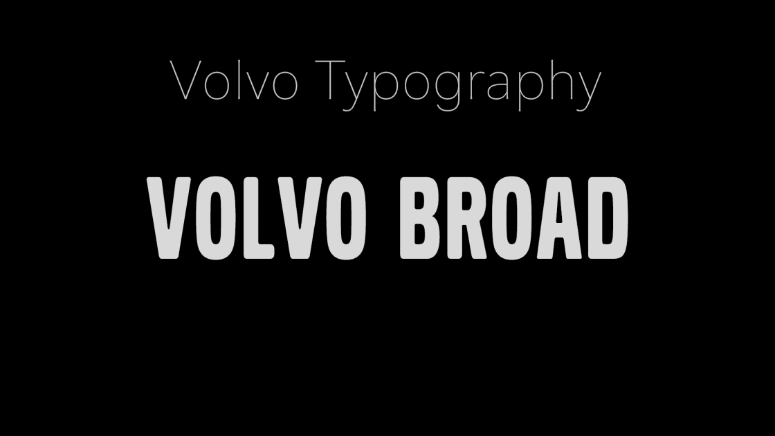
I can’t think of one automaker that has a signature font bedsides Volvo. When I hear or see “Volvo font” I think of Volvo Broad. Among car maker’s typefaces, Volvo Broad stands out as a distinctive and proprietary font, integral to the company’s visual communication. Designed specifically for Volvo, this typeface has been employed across various applications in Volvo advertising, contributing to the brand’s recognizable aesthetic.
Volvo Broad was first introduced in 1992, crafted by The Electronic Studio as a custom typeface to succeed the previously used Elston font. This bold, sans-serif typeface was designed to convey strength and clarity, aligning with Volvo’s brand values of reliability and innovation. A refined version, Volvo Broad Pro, was developed by Dalton Maag in 1997, enhancing its versatility and legibility for broader applications. These updates ensured the font remained relevant in an evolving automotive market, reflecting Volvo’s shift toward a more premium and luxurious image, particularly with models like the the S80 and XC90, launched in North America in 1999 and 2003, respectively.
Volvo Broad in Advertising
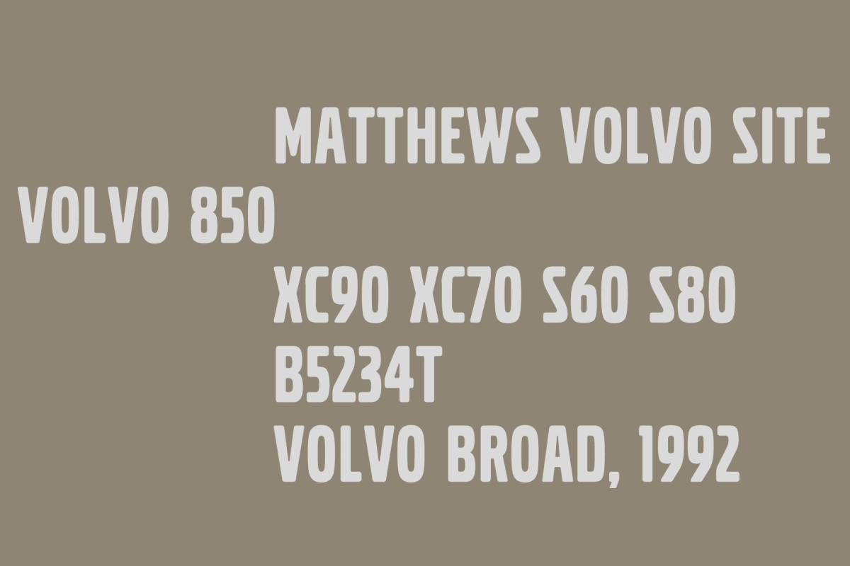
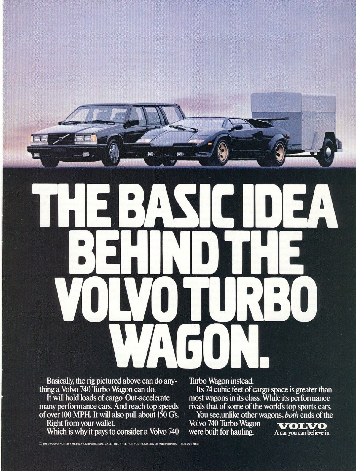
Volvo has used Volvo Broad in marketing and promotional materials, including billboards, brochures, and digital campaigns. Its bold, geometric structure ensures high legibility, making it ideal for headings and logos, though Volvo’s design guidelines caution against using it for long headings due to its weight.

Volvo Broad on/In Vehicles
Volvo Broad and Handel Gothic are often confused for one another, and I cannot find an instance of Volvo using Volvo Broad on or in an actual Volvo car or SUV despite the handful of random posts on the internet saying otherwise. Please contact me if you know my position on this to be incorrect.


Volvo Broad is Used Today
By the 2010s, Volvo expanded its typeface family, introducing Volvo Novum and Volvo Antikva alongside Volvo Broad to create a cohesive design system supporting Extended Latin, Cyrillic, and Greek characters. While Volvo Novum became the default for most text, Volvo Broad remained prominent for titles and branding elements, reinforcing its role in high-impact communications. Despite its proprietary nature, versions of Volvo Broad have been made available for free download, though Volvo strictly protects its intellectual property, limiting unauthorized commercial use. Today, Volvo Broad continues to embody the brand’s legacy, blending tradition with modernity across its global presence


