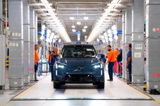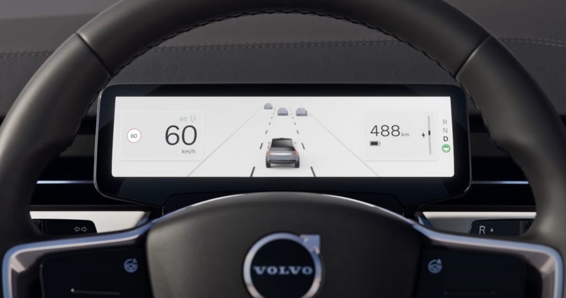
Look at that for a second. But only a second, because that’s all you’ll need, because there’s not much to look at, which is the point. Volvo is starting to understand this. And as we all know so well, when Volvo hits on something safety-related, everyone else has it in 10 years.
The key to this is simplicity. Less is more. Fewer distractions = better driving = fewer wrecks.

Red Pill vs. Blue Pill
Are you seeing a beautiful dovetail between safe driving and less information? This is the moment we as drivers (all drivers) need less… this moment in automobile history is the dovetail where a big move to simplify driving information meets the deluge of information coming in through our phones.
And it couldn’t have come a second too soon.
I see people every day driving and looking at their phones. Police are not the answer to this. There are just not enough police out there to stop even 1% of distracted drivers. I saw someone just 20 minutes ago on the way back from dropping my son off at school. They’re everywhere.
This dashboard simplicity won’t stop these phone-watchers, but it does represent a point on the Distraction Continuum™. The more Volvo and other manufacturers can pull the leftmost (safest) edge of this spectrum, the safer motorists will be, in aggregate.
This new clean design dashboard and center info display will bridge the gap from where we are now to where we’ll be in 10-15 years: Level 5 driving autonomy. At that point, us failure-prone humans won’t be piloting our cars, and crashes will drop significantly.
Or at least that’s when the era of a historic reduction in traffic crashes will begin (there will still be traditional vehicles on the road, smashing and crashing).
(Who is good at simplicity? Apple. They’ve been doing it since 1984. They’ve been organizing information into the smallest visual footprint for literally decades. This is why Apple is going to make a big run at automobile tech in the next few years. Can you think of a more important and ideal area for them to focus their efforts than driver information? I can’t.)
Yes… Now About that Touchscreen
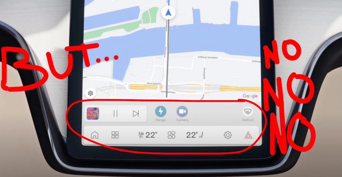
Volvo, you were doing so well until this section of the story. So here’s the bad news:
If you want to make progress in information overload prevention, don’t make the driver monitor more information. My God, it’s so simple but here they are taking one step forward and a half-step back.
Make this stuff into buttons! Physical, tactile buttons with little amber indicator lights. Not yet more crap to read and process on a screen.
Drivers Perform Better With Buttons Than With Touch Screens, Study Finds — it’s right there in objective terms, but anyone who operates a car with only a dead-feeling touchscreen could have told you putting important functions on a touch screen is bad for driving.
This type of thing has been plainly evident since the 1980s in aviation, and certainly before that. I recall reading about the huge amounts of work NASA put into making Mercury/Gemini/Apollo/Space Shuttle information presentation as simple as possible. Perhaps Volvo is smitten with Google’s idea of driving, since they use Google for this.
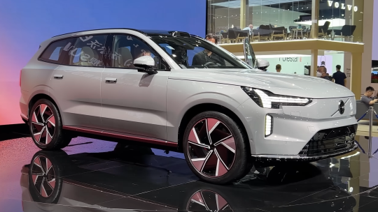
Ok, rant over. Overall, Volvo is on the right track, and I look forward to driving an EX90 to experience all this hard work.
Last Updated on May 9, 2023