

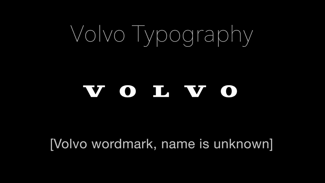
The Volvo logo’s lettering, specifically the wordmark — a text-only statement of the name of a company for purposes of identification and branding — uses a custom typeface not publicly available, designed exclusively for the brand. While no official name for the logo font is disclosed, sources suggest it’s closely related to Clarendon Text Bold, a slab-serif typeface designed by Robert Besley and released by Thorowgood and Co. in 1845. The logo’s typeface features bold, uppercase letters with thick, square serifs, slightly condensed spacing, and clean, geometric forms for legibility and impact.
Other typefaces in the MVS Volvo typography series: Handel Gothic and Volvo Broad
Historically, Volvo’s wordmark evolved significantly. From 1927 to 1930, the logo used a serif typeface similar to Decal JNL Regular or Newsprint JNL Wide Regular, with wide letters in white on a blue oval. By 1930, a minimalist black wordmark adopted a serif style with less contrast between strokes, resembling Jeff Levine’s Song Stylist JNL Regular. In the 1960s, Volvo briefly used a sans-serif version, but reverted to serif designs by 1970, emphasizing bold, condensed letters.
In 2013, Volvo refined its logo, adjusting the wordmark’s typeface to appear more streamlined and elegant. The update reduced serif thickness and tightened letter spacing for a modernized look, aligning with the brand’s shift toward a sleeker aesthetic. The typeface retained its Clarendon-like characteristics but was customized further to enhance sophistication.
Volvo also employs proprietary fonts like Volvo Novum and Volvo Antikva for marketing and editorial content, but these are distinct from the logo’s wordmark. The logo’s typeface, while Clarendon-based, is uniquely tailored, ensuring brand consistency across applications. Attempts to replicate it often point to Clarendon Bold or Besley for their similar slab-serif structure. No exact match exists due to Volvo’s proprietary design.

If you know the name Volvo uses internally for this font, please leave a comment below.
Sources: fabrikbrands.com, companylogos.org, fontslogo.com


1 Comment
the volvo iron mark logo is literally the alchemical symbol for iron (also the astrological symbol for mars)
https://periodic-table.rsc.org/alchemy/26/iron
https://en.wikipedia.org/wiki/Alchemical_symbol